Vital.io — Full Website Architecture & UI Design
Client:
Role:
UX Design & Development
TImeline:
3 Months
Introduction
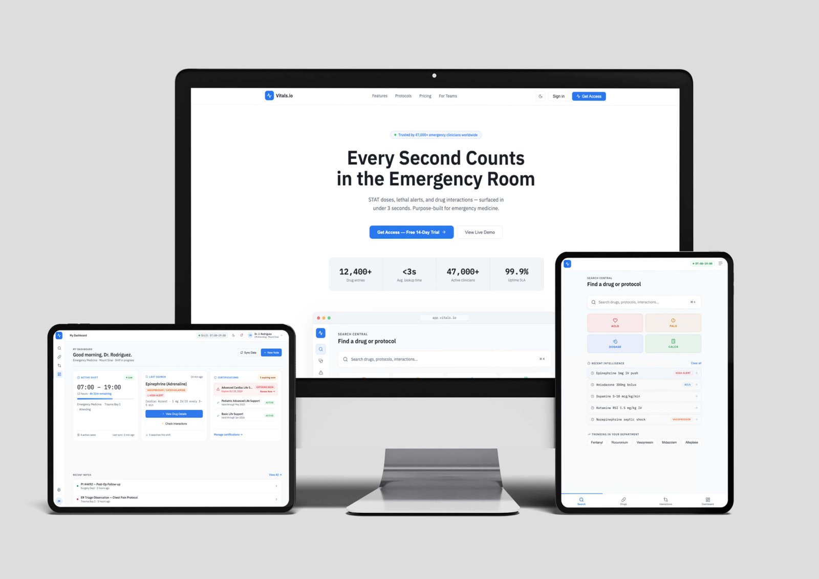
This project began as a client engagement: an emergency medicine physician approached me with an idea for an app and website built around a problem he saw daily in his own practice. Physicians need to know, in under three seconds, which drug to administer, the exact dose, and whether it dangerously interacts with another medication and most digital tools weren't built for that kind of pressure.
The original implementation never fully shipped. I later rebranded the concept as Vitals.io, giving myself the freedom to rethink and improve the prototype beyond the original brief.
The Challenge
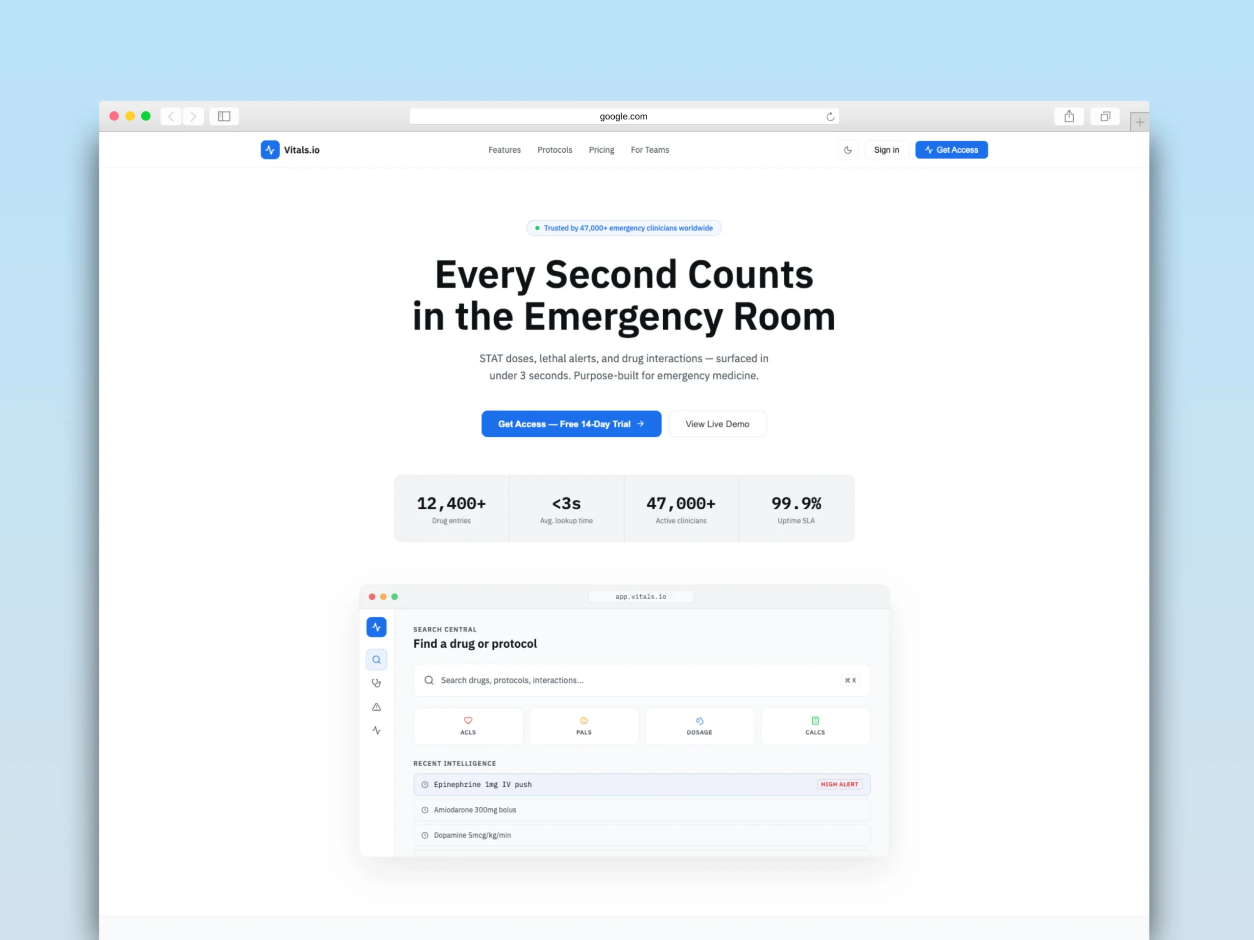
The core problem wasn't about interface, it was about information hierarchy under stress. Existing pharmacological reference tools for emergency medicine share the same failures: they present information in a generic directory format, bury the critical dose inside secondary text, and make no visual distinction between information that can wait and information that cannot wait a single second.
Add to this the physical context: physicians consult these tools on hospital screens with variable lighting, wearing gloves, in motion, with the patient in front of them. The design has to work under those conditions not under ideal demo conditions.
I defined three non-negotiable design constraints from the start: critical information, especially the STAT dose, must be readable in under 500 milliseconds without any additional user action. The most important action on each screen must always be visible without scrolling. And any lethal safety alert must be impossible to ignore, not merely visible.
Creative and Technical Process
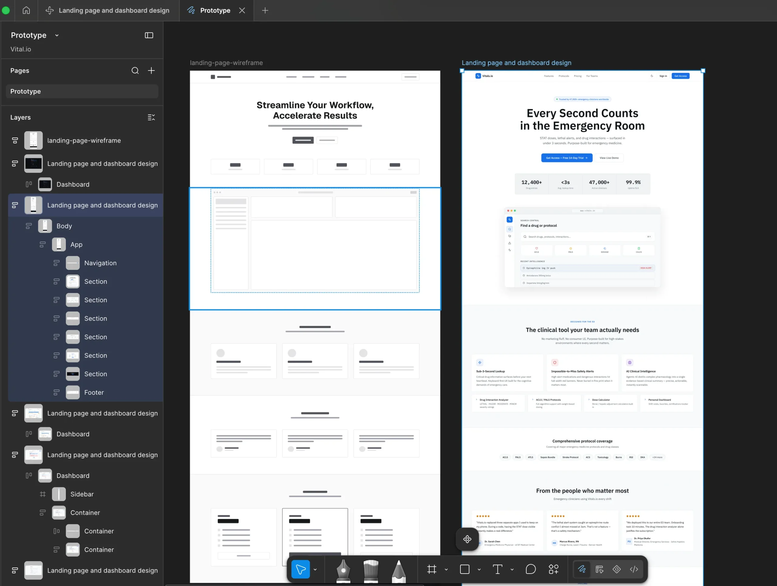
The process began with a critical analysis of existing tools and a previous prototype I had built myself. I documented every usability problem specific to the emergency context: a permanently expanded sidebar consuming clinical content space, the primary action button buried at the bottom of the page, the STAT dose carrying the same visual weight as secondary text, and the absence of differentiated alert states. With that diagnosis, I designed a solution in Figma, defining a sidebar collapsible to 60px by default with hover expansion, a typographic hierarchy where the dose occupies 56px in IBM Plex Mono, a semantic color palette where red always means lethal danger and is never used decoratively, and a dual token system for light and dark mode with equal refinement in both.
The design went through four iterations, each evaluated against the clinical usability criteria I had defined, until I reached a coherent and functional visual system. The final implementation was built in React, using Lucide Icons for iconography and IBM Plex Sans alongside IBM Plex Mono as the system typefaces. Choosing a monospaced font for clinical values wasn't an aesthetic decision, it makes numbers easier to read and less prone to misreading under speed.
Implemented Solutions
Emergency Visual Hierarchy
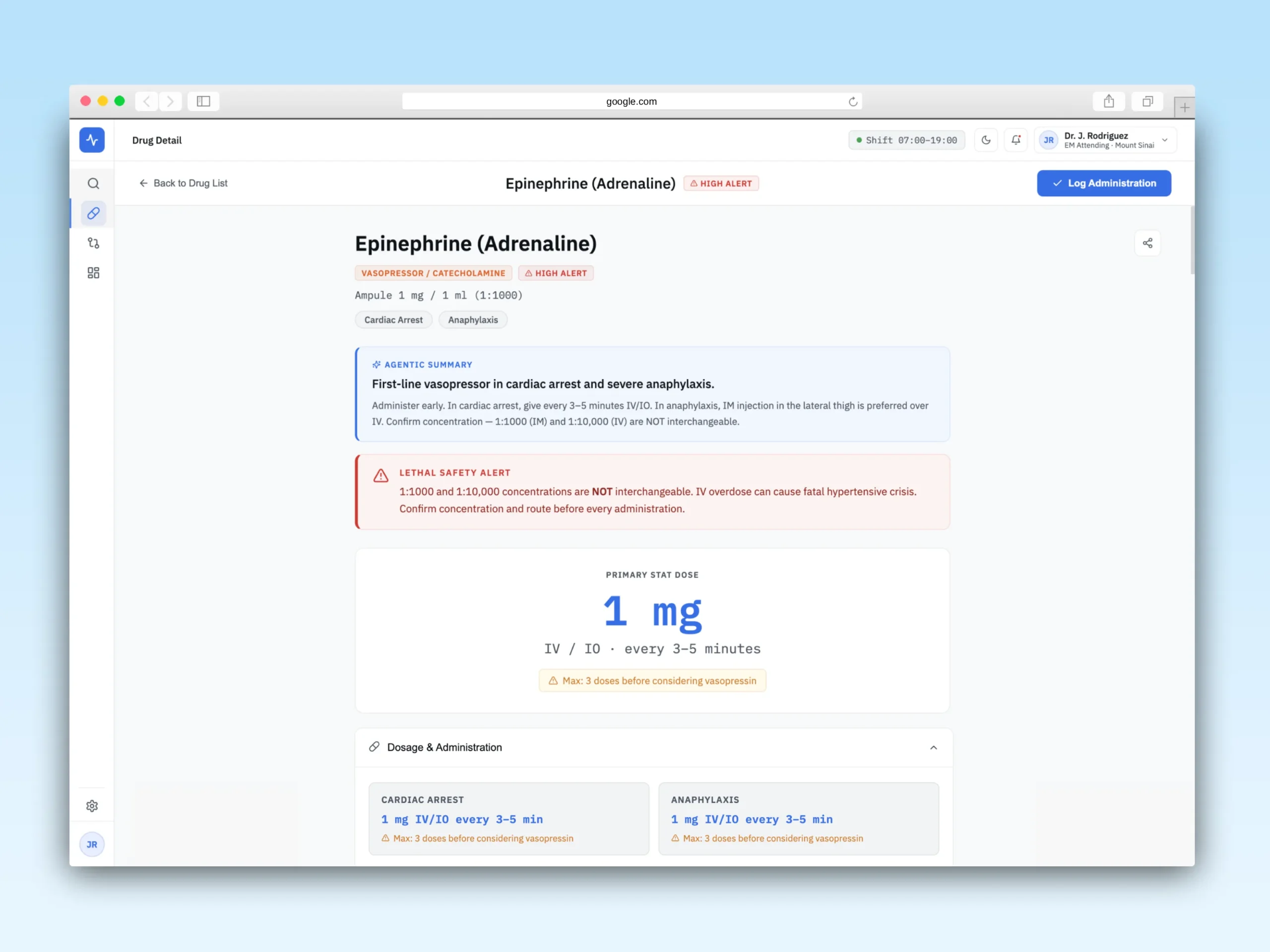
The most important element of the Drug Detail page is the STAT Dose Hero: the primary drug dose at 56px, weight 700, in monospaced type and accent color. It is the visually dominant element on the screen, designed to be read before the eye consciously processes the rest of the information. Immediately above it live two alert elements: the Agentic Summary, a concise clinical summary with the most decision-relevant information, and the Lethal Safety Alert, a full-width red banner that appears only when the drug carries a documented lethal confusion risk. Epinephrine, for example, displays the warning about 1:1000 and 1:10,000 concentrations not being interchangeable. This banner cannot be collapsed or dismissed.
Primary Action Always Accessible
The "Log Administration" button lives in the sticky header of the Drug Detail page. Regardless of how far the user scrolls to read dosage and preparation information the button is always visible at the top. This decision came directly from the analysis of the previous prototype, where that button was at the bottom of the page, which is clinically unacceptable.
Drug Interaction Analyzer
The interactions screen presents a horizontal severity gauge with four levels: MINOR, MODERATE, MAJOR, LETHAL. Where the active level is visually highlighted. The result includes the pharmacological mechanism explanation, clinical guidance specific to the emergency setting, and the interaction onset time. The architecture is ready to connect real-time AI analysis.
Dual Design System
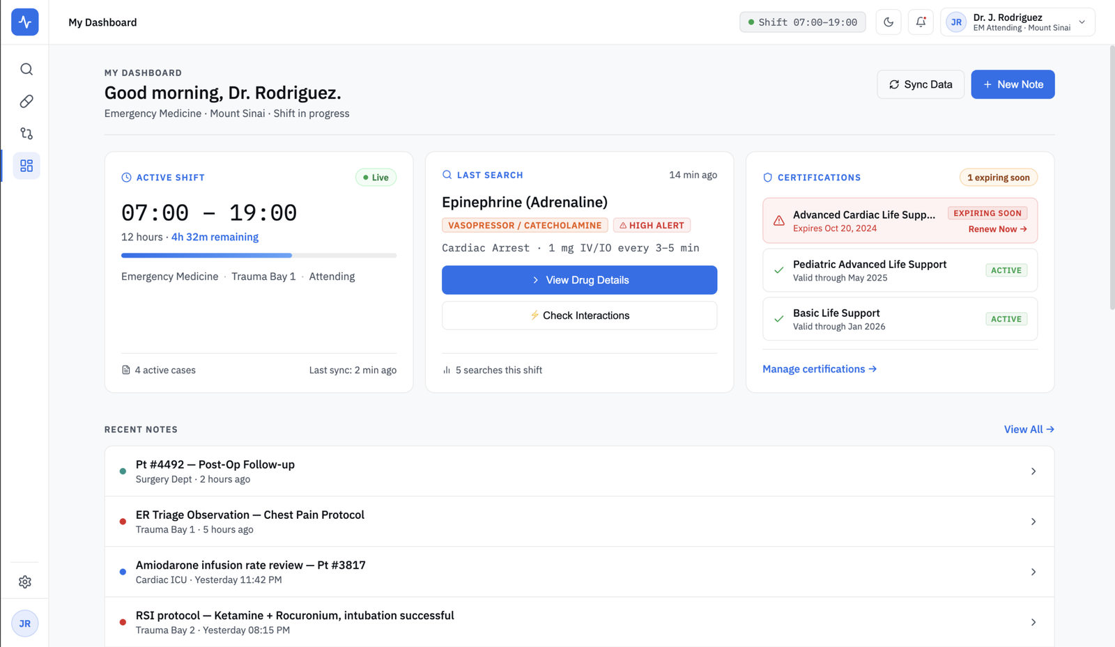
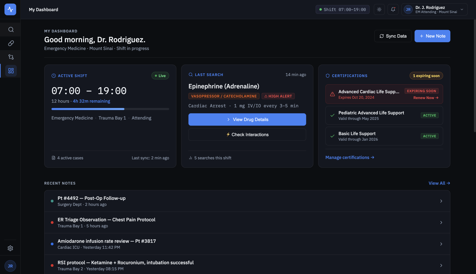
The project has light mode and dark mode with equal refinement. Light mode is the primary experience, better readability in hospital environments with intense artificial lighting. Dark mode is designed for overnight shifts where reducing visual fatigue is the priority. Color tokens are semantic: the same clinical meaning always maps to the same color in both modes.
Results
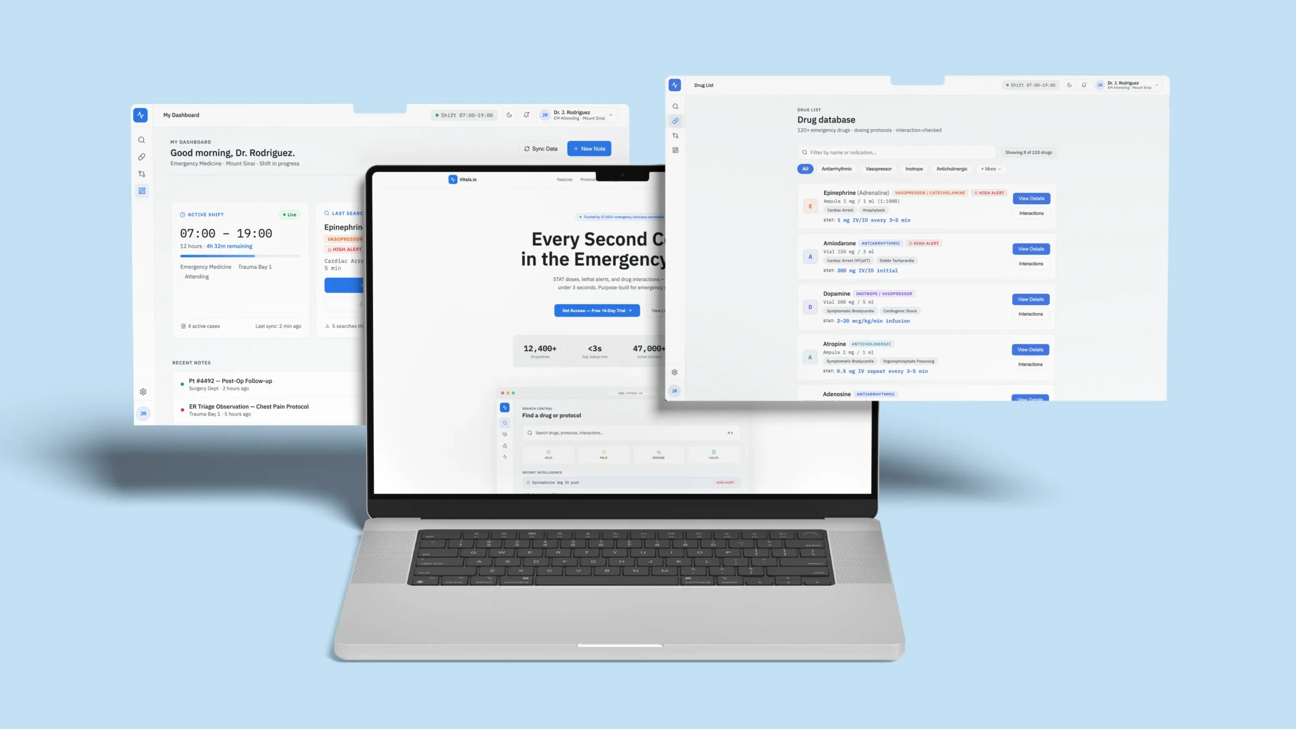
Vitals.io is deployed as a functional prototype at demo.danielweb.net/vitals/ with all screens navigable and clinical modules operational.
The project demonstrates the integration of three disciplines that rarely appear together in a single portfolio: UX research with specific clinical criteria, complex visual system design with dual tokens and emergency hierarchy, and complete technical implementation in React from design through production deployment.
Beyond the visual output, Vitals.io is an exercise in design under extreme constraints, where every decision must be justified not only aesthetically but functionally for a user under maximum pressure. That kind of thinking transfers to any product where clarity and speed of comprehension matter.